OVERVIEW
Redesigning Palona’s brand and product experience to make AI feel approachable and increase conversion
Palona is a startup building AI-powered hospitality agents for restaurants. During my internship, I led a full
corporate website redesign and contributed to the design of an internal analytics dashboard. As a product design engineering intern, I was responsible for both the visual/UX design and the front-end implementation of key features — collaborating closely with the CEO, product manager, and engineering team to ensure a cohesive, feasible, and impactful redesign.
The core challenge was not just a visual refresh, but also was accessibility in the broad, product sense:
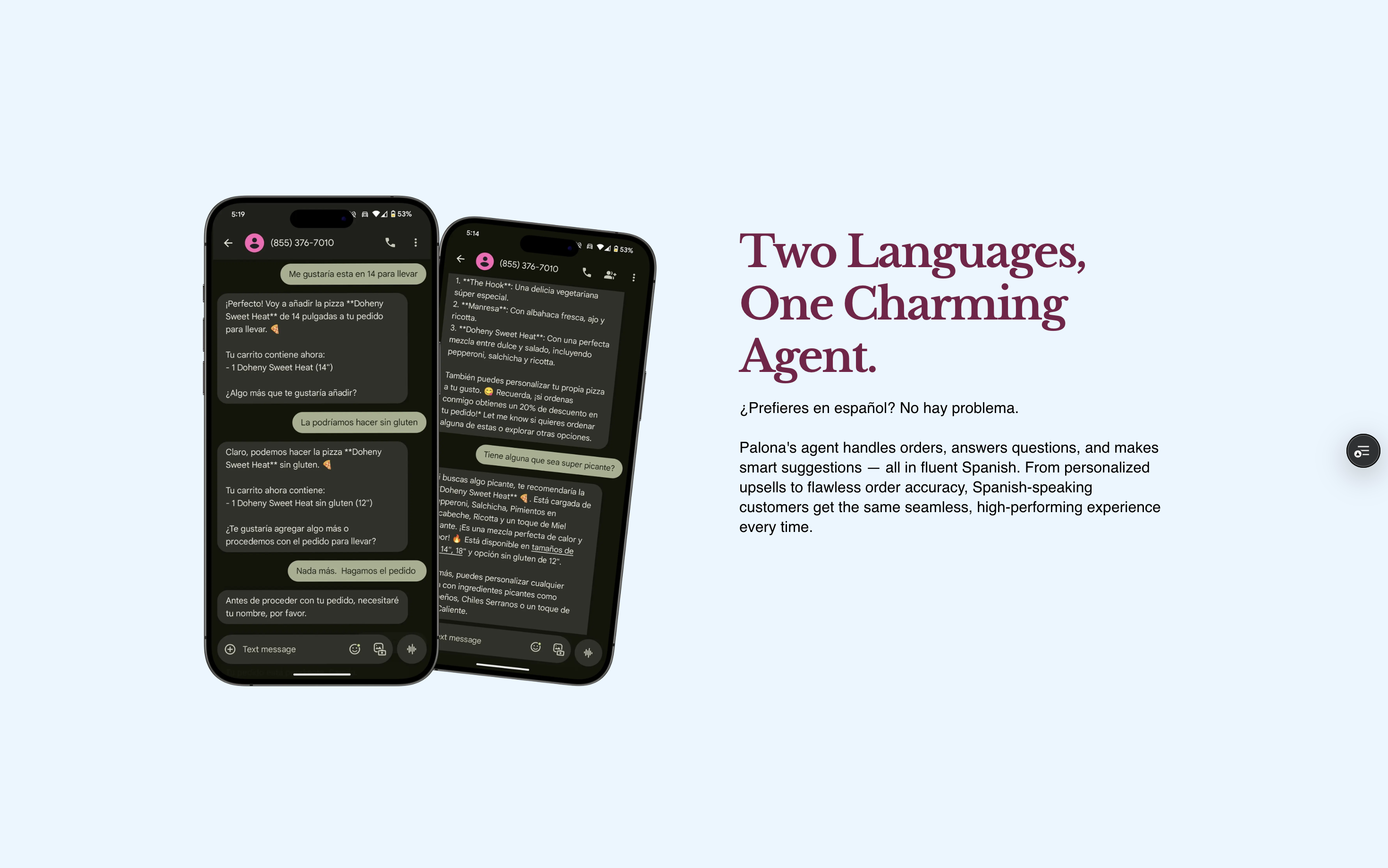
making complex technology legible to non-technical operators. Restaurant owners were visiting the website,
but demo conversion rates were low because the site felt overly technical, visually inconsistent, and unclear in
its value proposition.
RESEARCH & USER INTERVIEWS
Understanding how restaurant operators evaluate AI tools
I worked closely with the CEO to align on business goals and conducted interviews with restaurant owners and managers.
We learned that decision-makers wanted credibility, speed, and clear ROI and that “generic startup” signals
reduced trust.
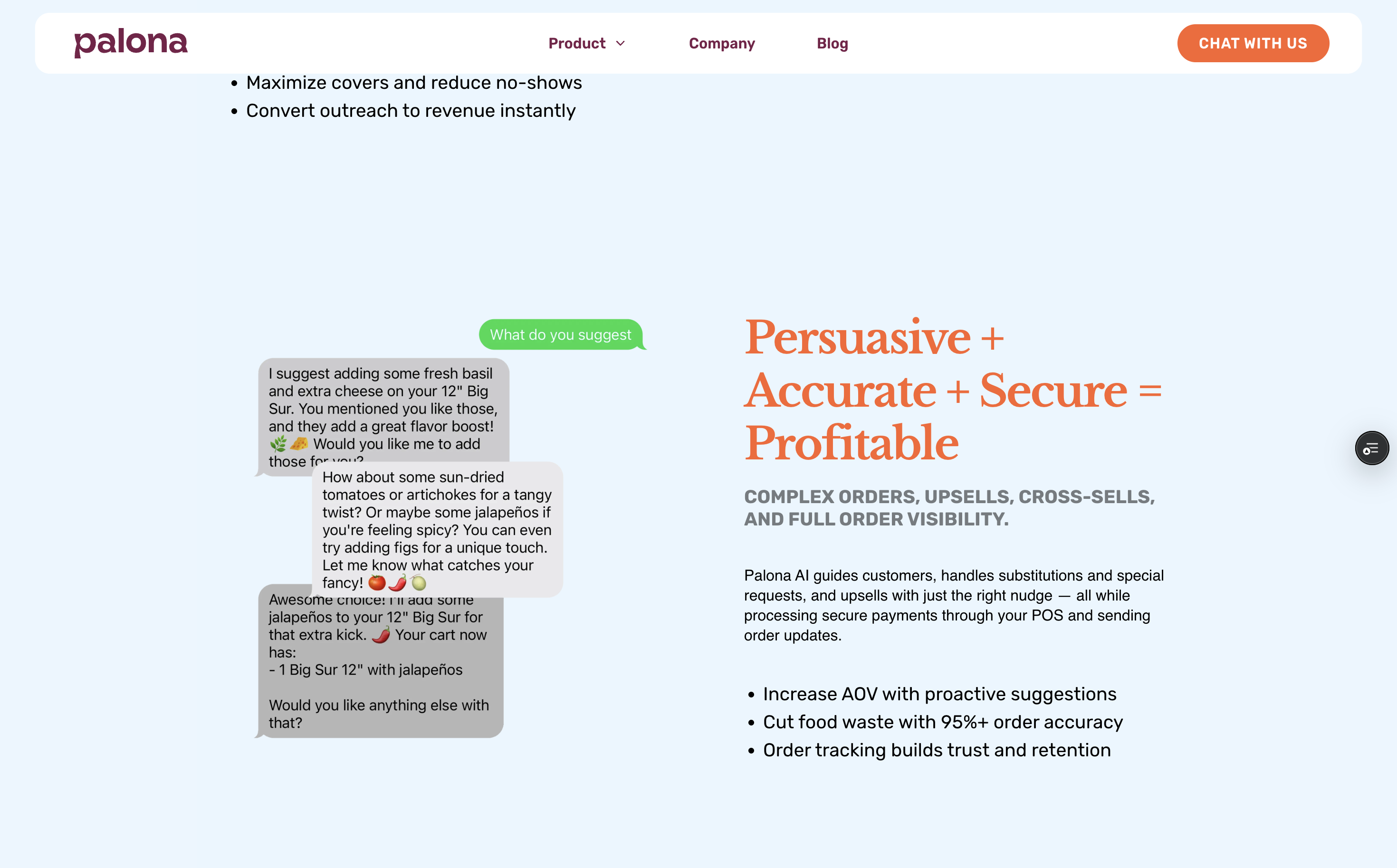
- Content bloat: Too much technical language obscured the product’s value.
- Tone mismatch: The website sounded like a startup pitching investors, not a partner serving restaurants.
- Conversion friction: Calls-to-action were visually weak and disconnected from the user’s decision flow.
I also ran competitive analysis across key competitors to compare messaging tone, visual hierarchy, and conversion strategies.
A recurring pattern: the strongest sites led with outcomes and proof, not features.
DESIGN STRATEGY
Make knowledge accessible: simplify, structure, and guide action
I treated accessibility as comprehension by meeting operators where they are, and making AI feel hospitable rather than intimidating.
The redesign centered around three pillars:
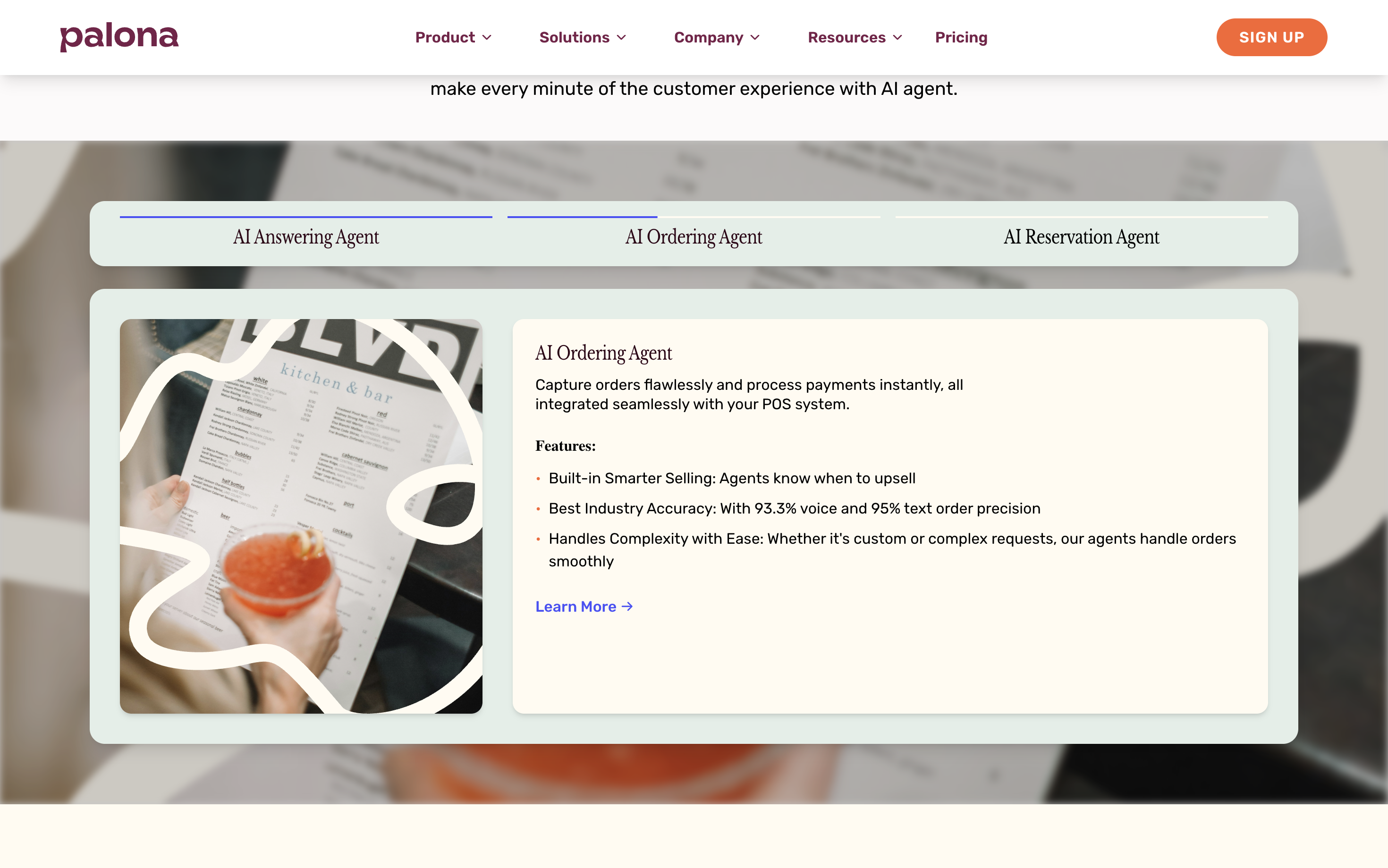
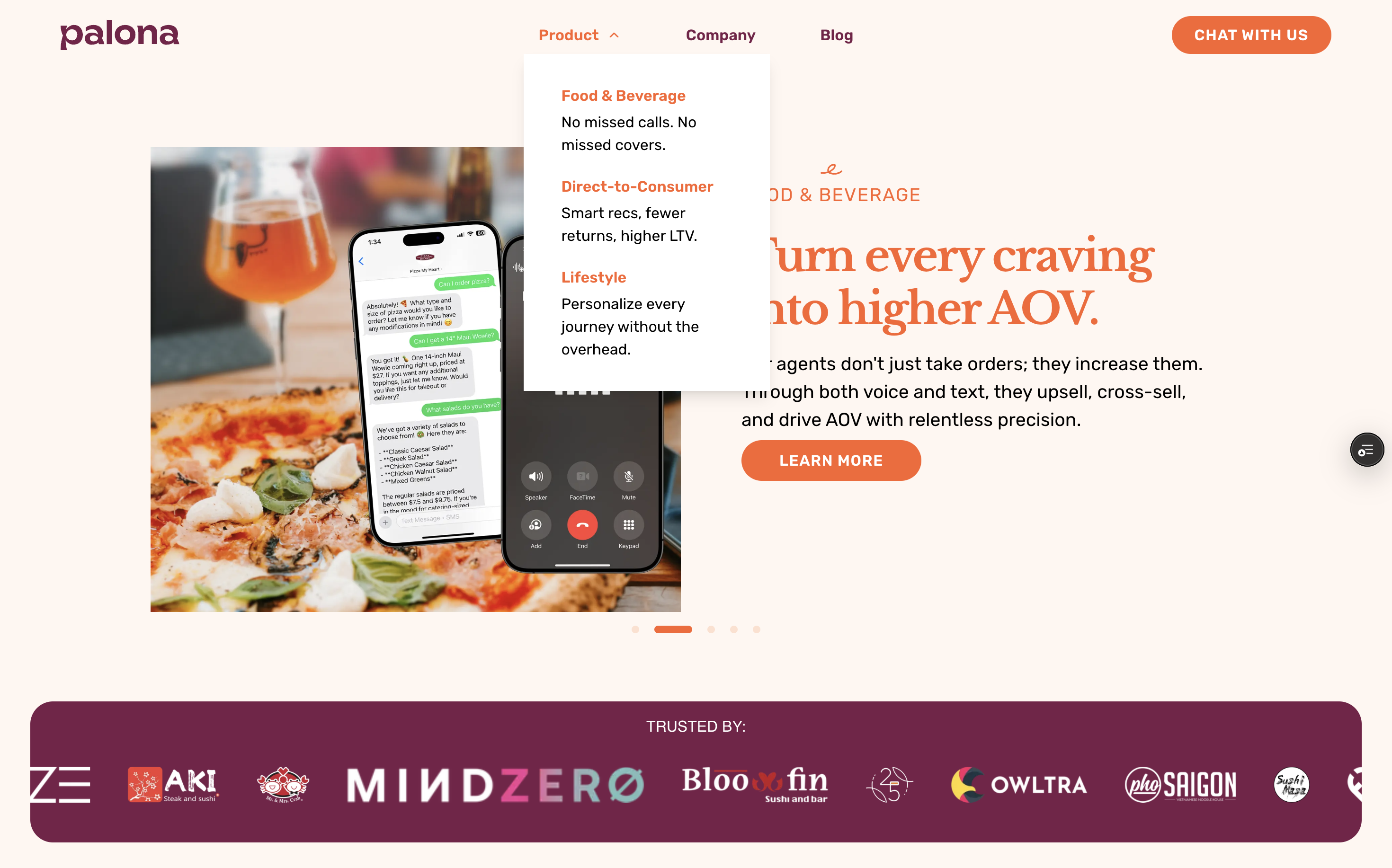
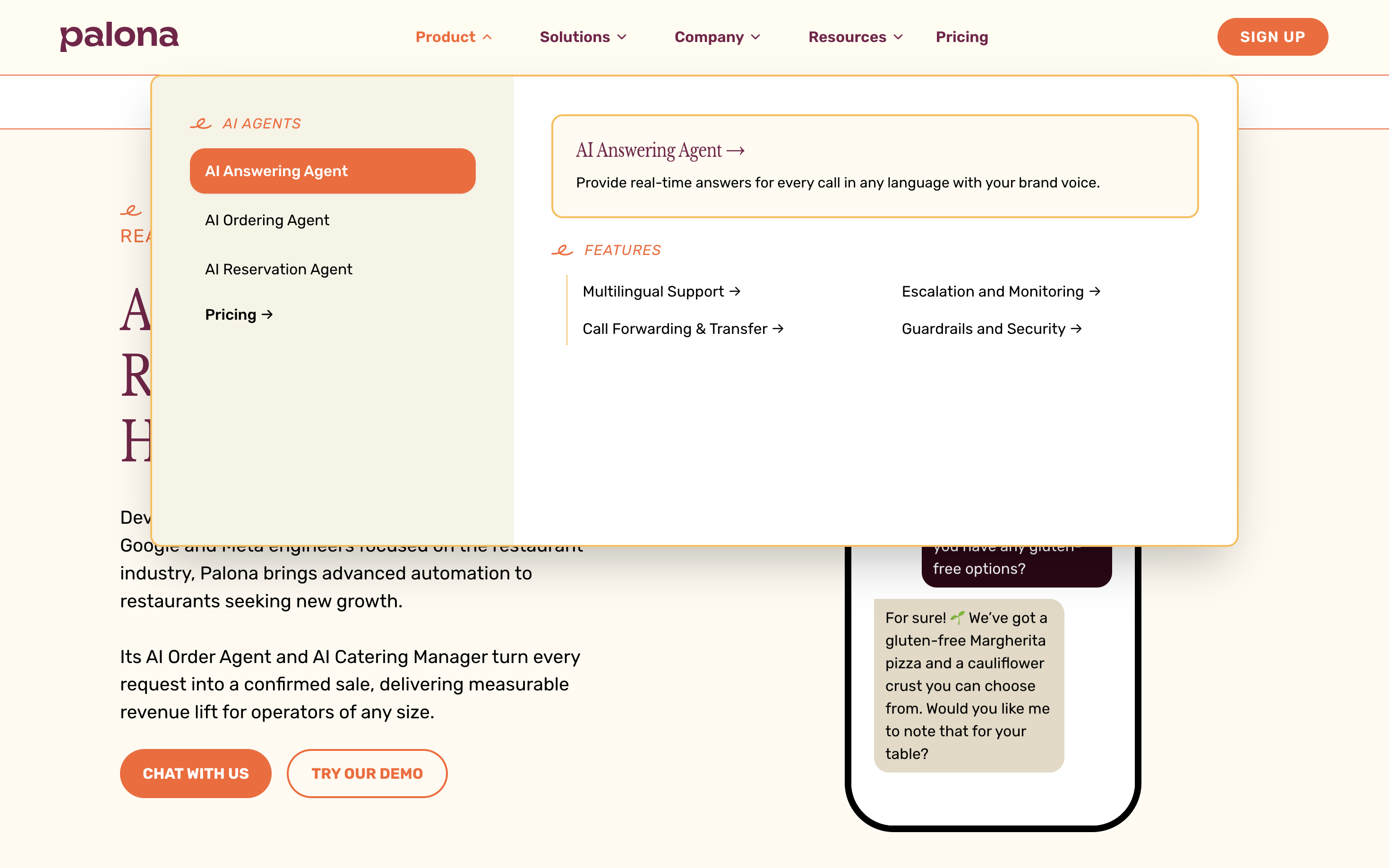
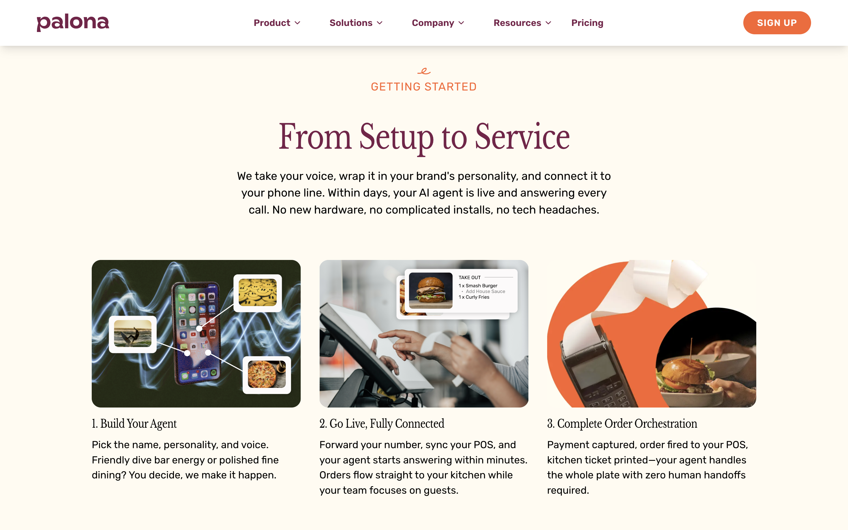
- Simplify the story: Reduce jargon and lead with what restaurants gain (time saved, fewer missed calls, better guest experience).
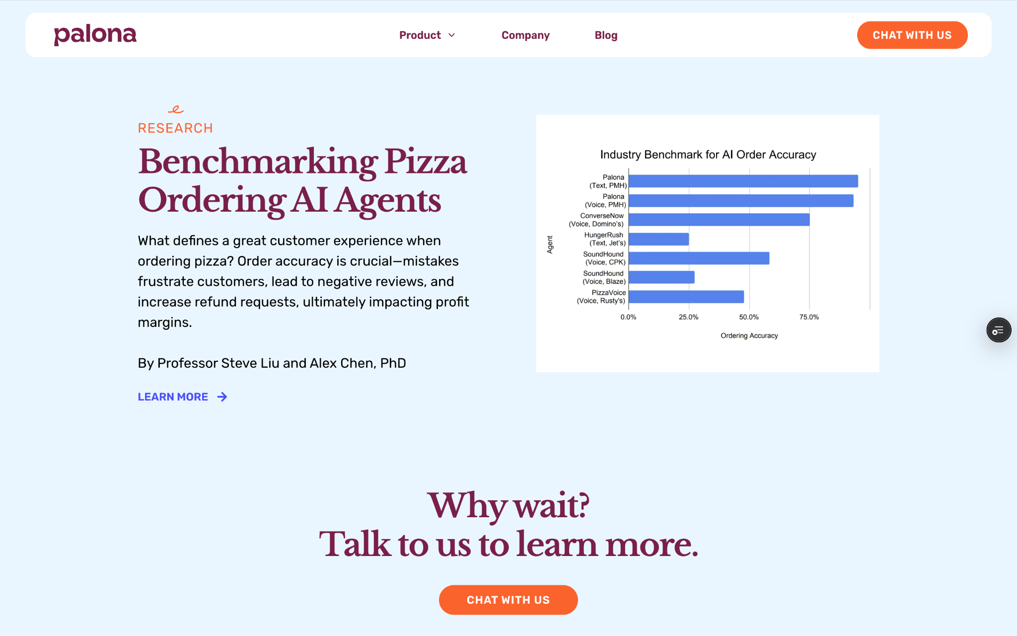
- Strengthen credibility cues: Cleaner typography, consistent components, and real-world context increased trust.
- Improve conversion flow: Clear navigation and high-visibility CTAs shortened the path to scheduling a demo.
This reframing turned the website into an “accessible explanation layer” — making the product feel understandable within seconds.
DESIGN ENGINEERING WORKFLOW
Designing with technical feasibility in mind
In addition to leading visual and UX design, I translated key patterns into production-ready React + TypeScript components.
I collaborated closely with the engineering team to understand constraints (layout architecture, responsiveness, performance, and deployment),
and used those constraints to inform design decisions early — minimizing rework and keeping the system maintainable.
I used GitHub Copilot selectively to accelerate repetitive implementation tasks (component scaffolds, typed props, layout variants),
while keeping ownership over interaction decisions, accessibility considerations, and overall system structure through review and iteration.
- Feasibility alignment: validated complex layouts and navigation behavior with engineering before locking designs.
- Reduced handoff friction: designing in Figma and implementing in code shortened iteration loops.
- System consistency: maintained reusable components to prevent future “tone drift” and visual fragmentation.
REFLECTION
Accessibility is clarity: design that makes knowledge usable
This project reinforced that good design makes complex systems feel understandable. By reducing jargon, improving hierarchy,
and building reusable structures, we made Palona’s AI feel more “hospitable” — and improved measurable business outcomes.
- Design for accessibility: make advanced tools legible to non-technical users through structure and language.
- Prototype collaboratively: bridge design + engineering to move faster with fewer surprises.
- Measure impact: clarity can be evaluated through behavior and conversion, not just aesthetics.